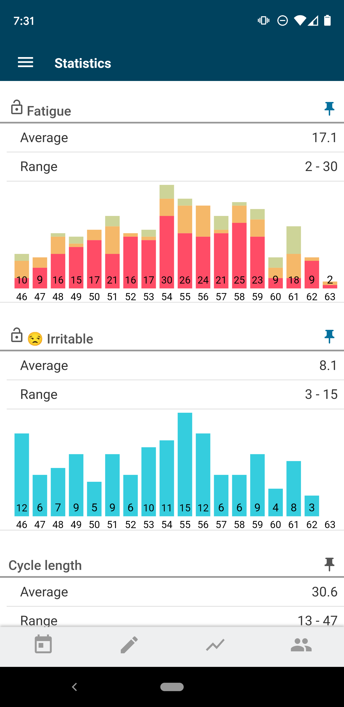
Kindara’s new feature, Cycle Stats, will make tracking your health over time even easier. Spot patterns based on your actual data by the provided graph and see the average and range (low to high) for each of these components of your cycle.
How do I open Cycle Stats in Kindara?
Apple iOS devices:
Open the Kindara App and Tap More on the navigation bar:
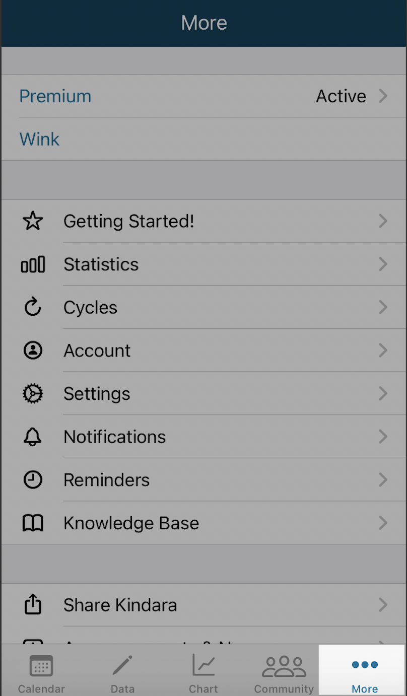
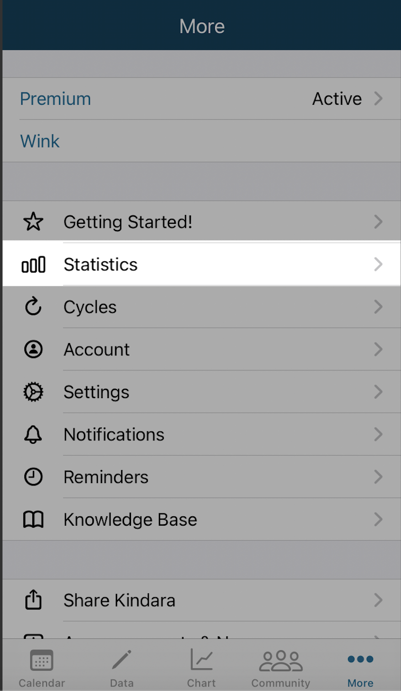
Tap Statistics:
Android devices:
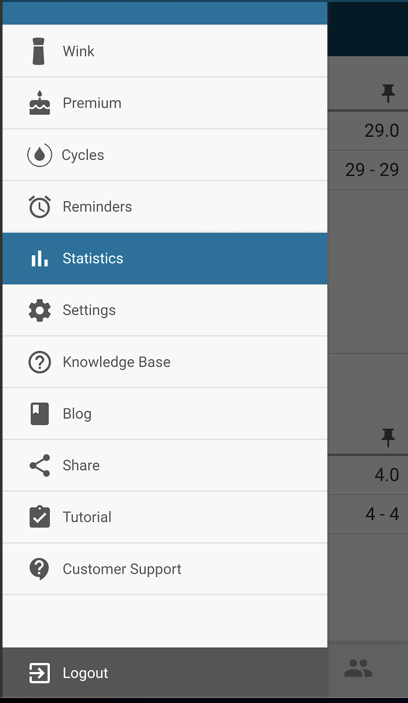
Open the Kindara App and Tap Menu in the top left-hand corner:
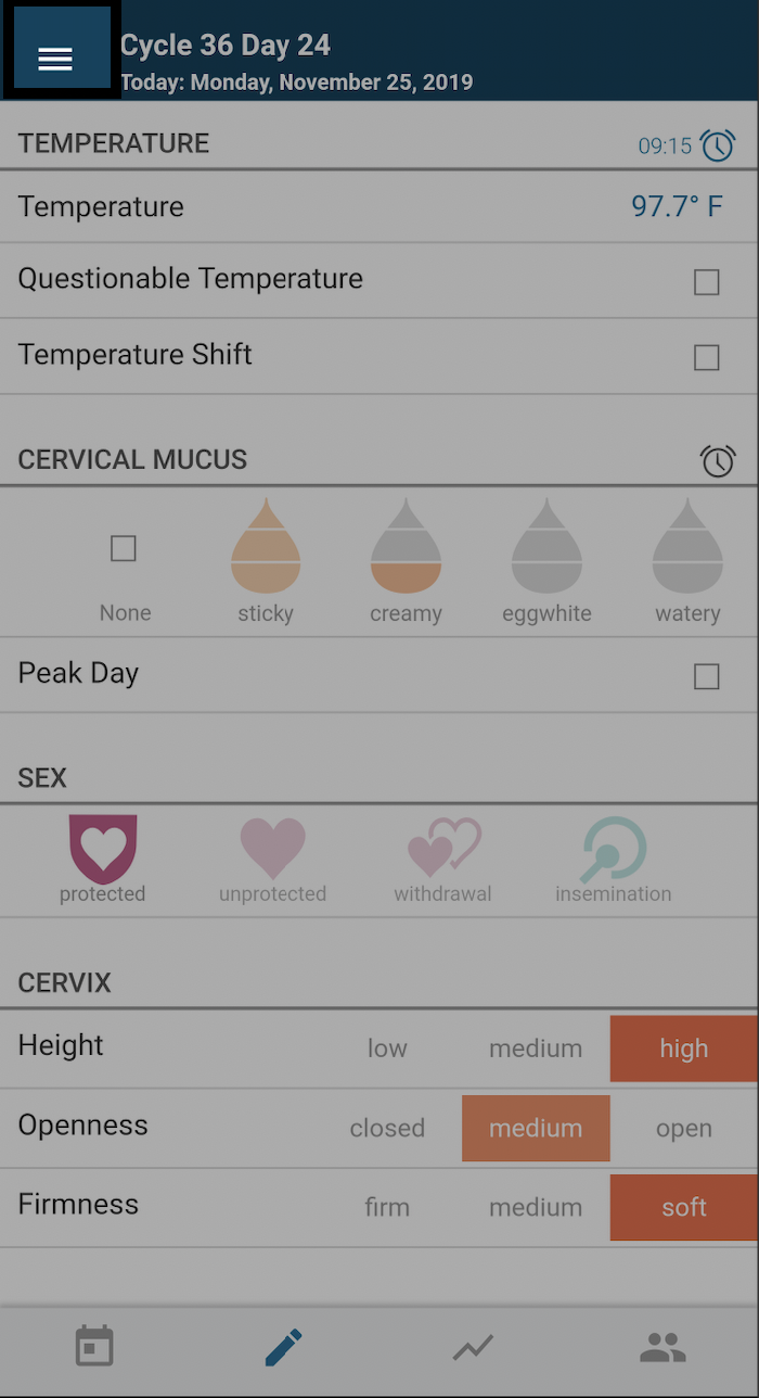
Tap: Statistics from the Menu dropdown screen:
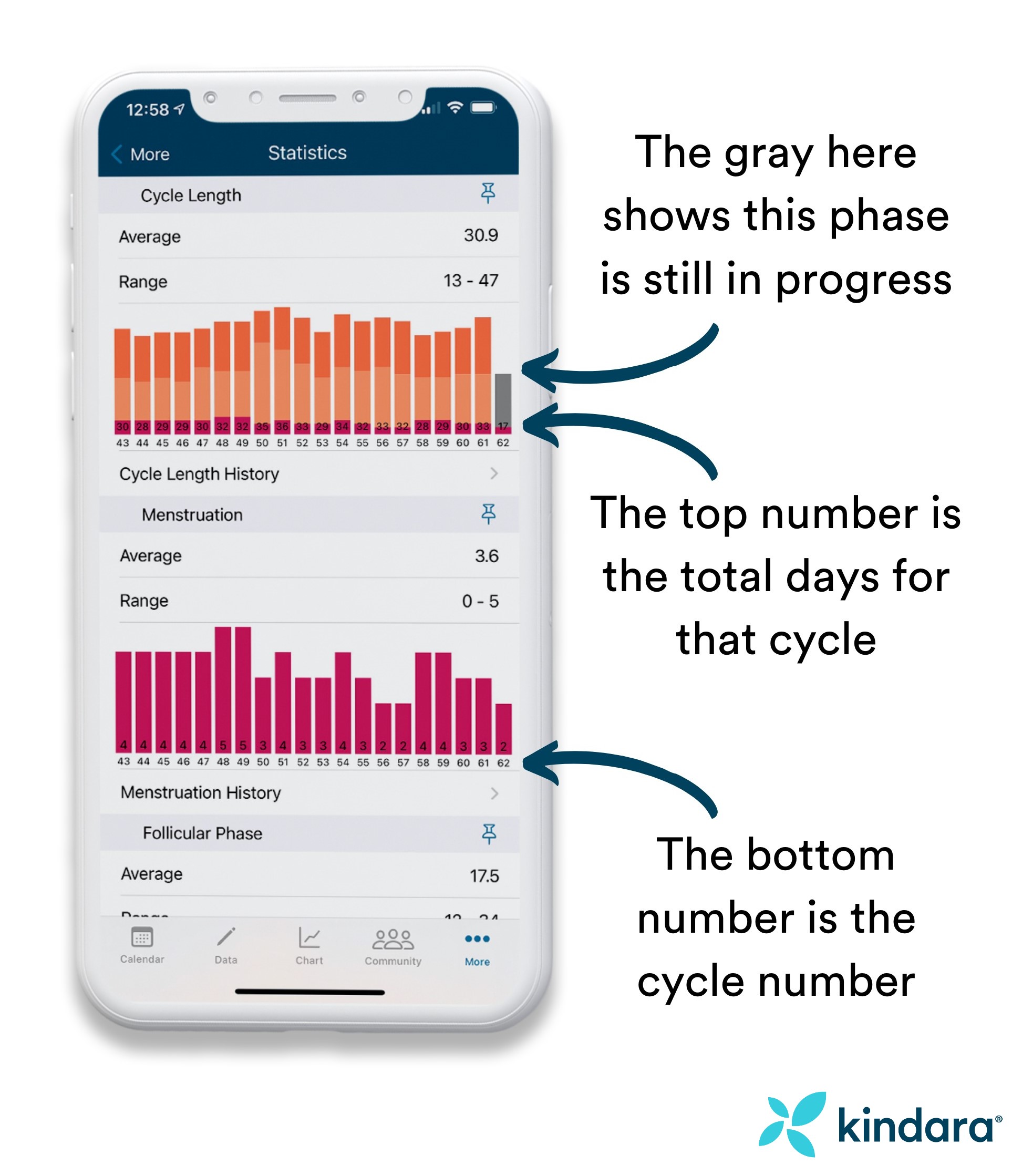
What do all the numbers mean?
From the Statistics tab you can easily visualize your overall data such as Cycle length and Period length. If you’re tracking BBT and marking temperature shifts, you’ll also see follicular phase and luteal phase length:
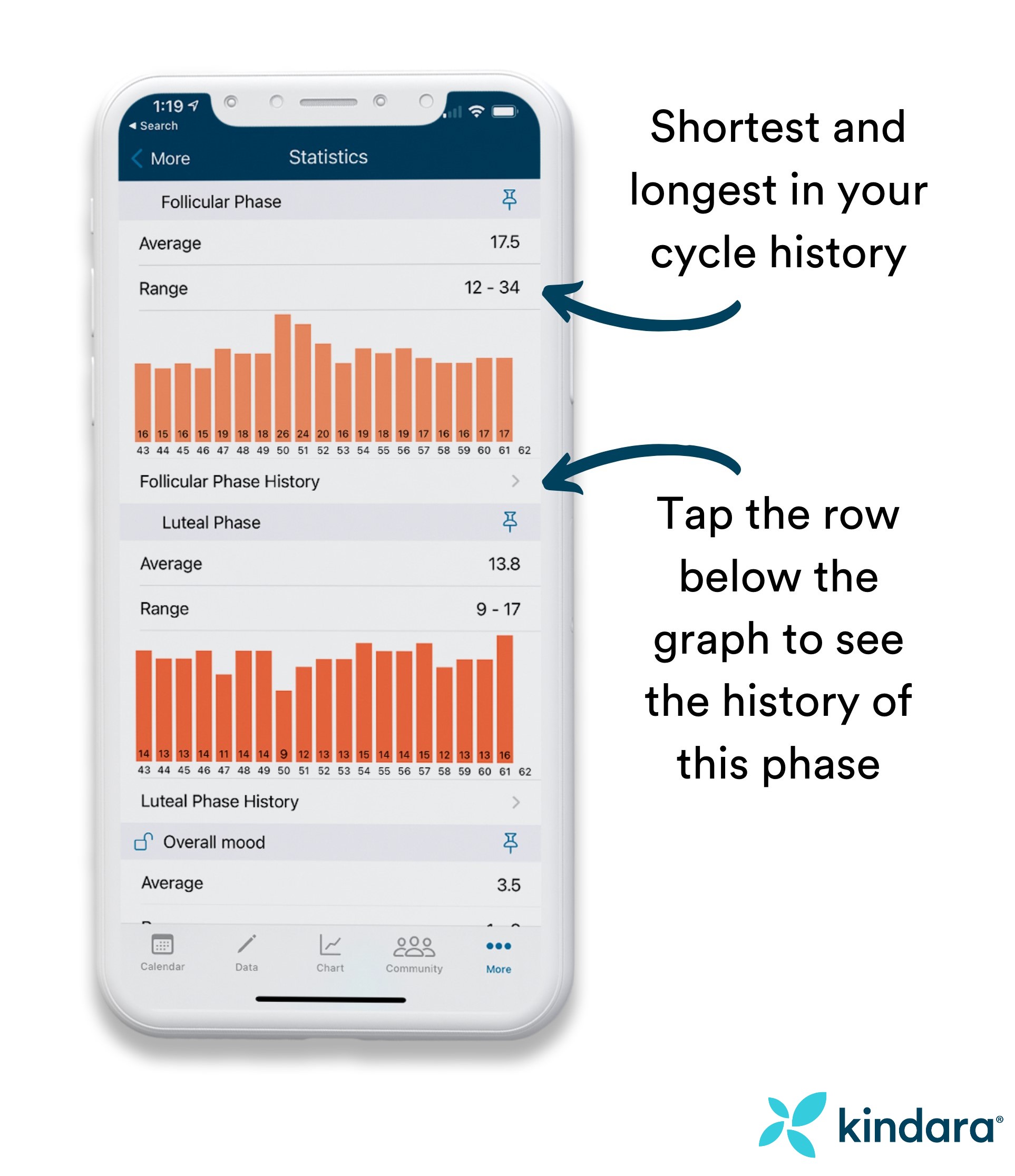
Cycle and Phase History
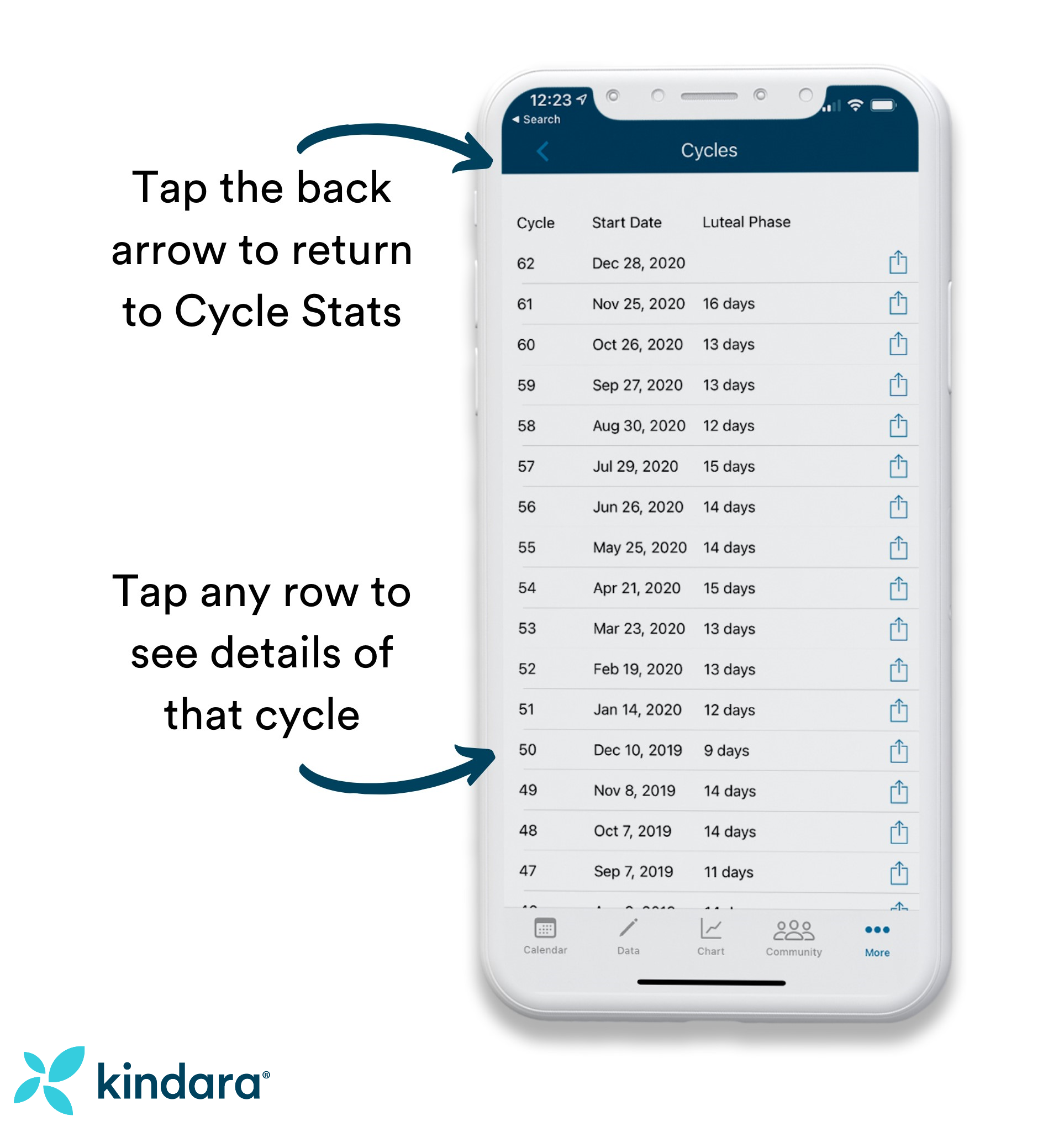
Tap the row below the graph to see a list of your cycles with the start date and length of that phase. In the example below, you can see Cycle Length History.
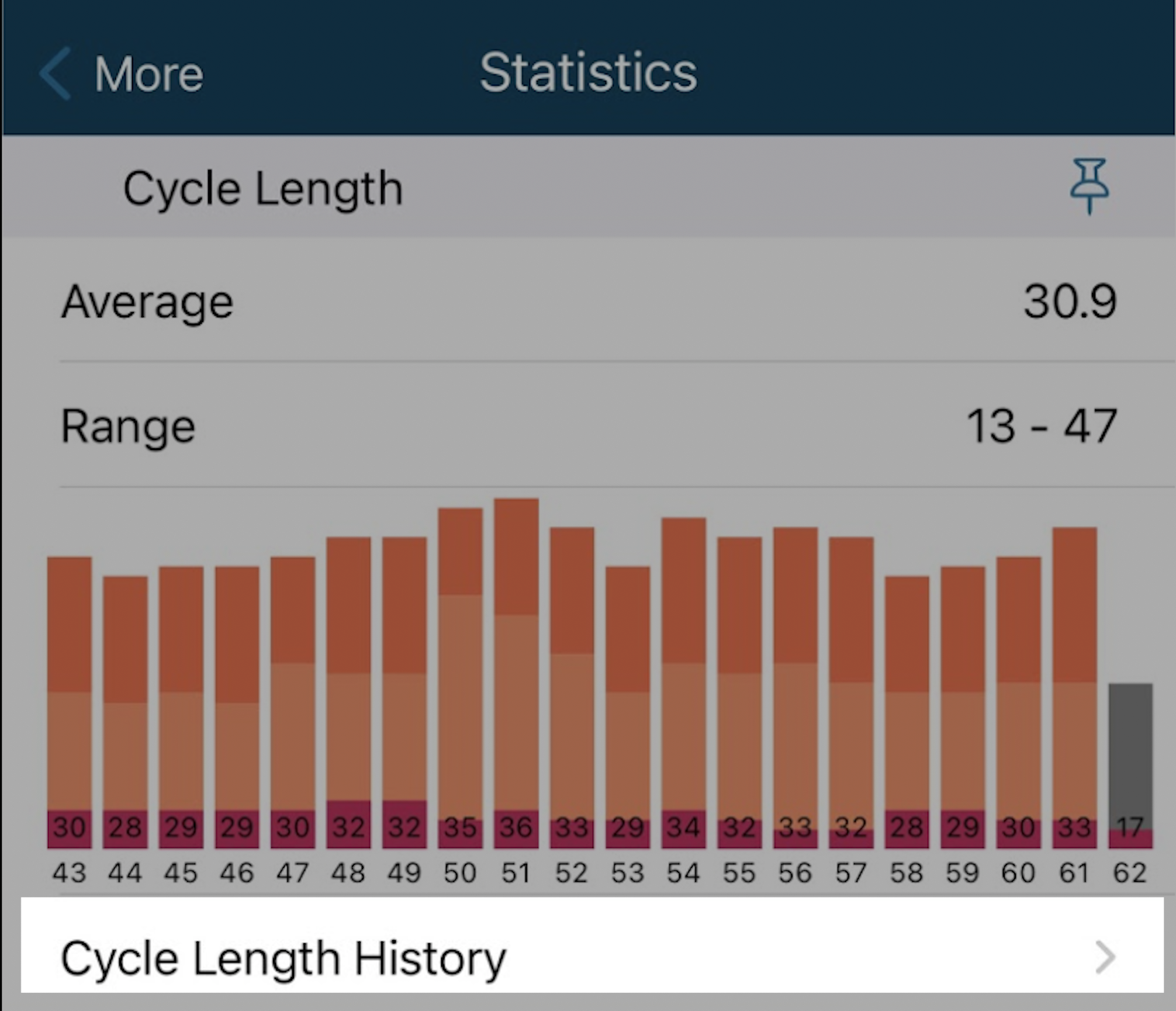
This will take you to the Cycle Length History:
Premium Cycle Stats
If you're a Premium member, you'll also be able to see statistics for Moods, Symptoms, and Custom Data. For even better review of your menstrual cycle history and symptoms, you can pin any graphs to the top if you’d like to do a quick comparison.
Tap the Pin icon in the upper right of the graph you'd like to pin to the top of your Cycle Stats screen:
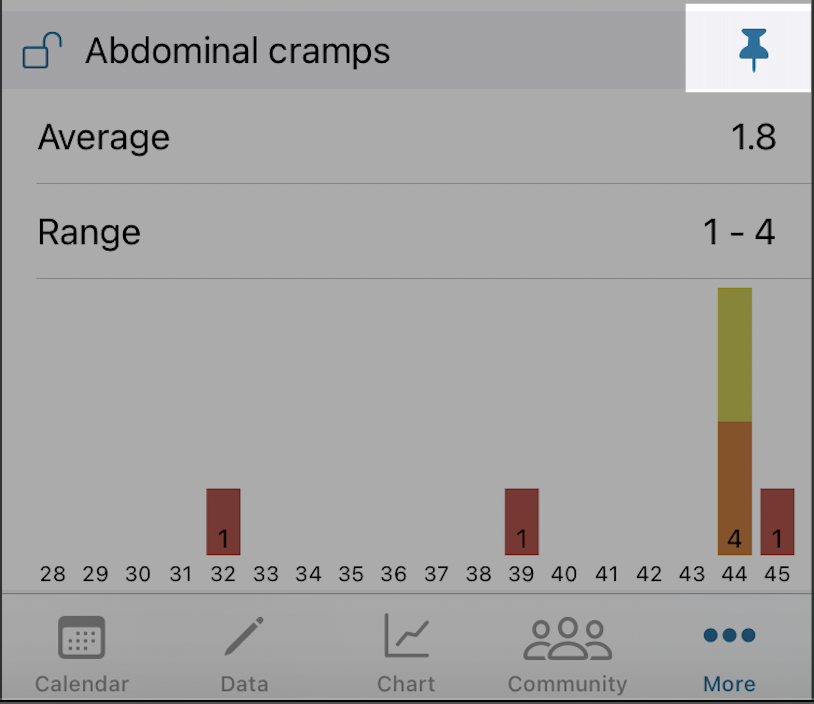
Use the Pin to quickly compare two or more graphs at the top of your Statistics tab: